On this page I will be presenting the building of my poster, how I created it and what ideas did and did not work.
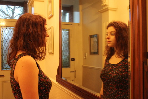
The first image, seen above, is just a simple and effective image of the main character looking into the mirror. I liked this image as it allowed me to build on different ideas and work on the positioning of the characters, fonts, colours and title. However I did not like the colour balance, I felt it was to yellow and needed to be adjusted, this I did on photo shop.
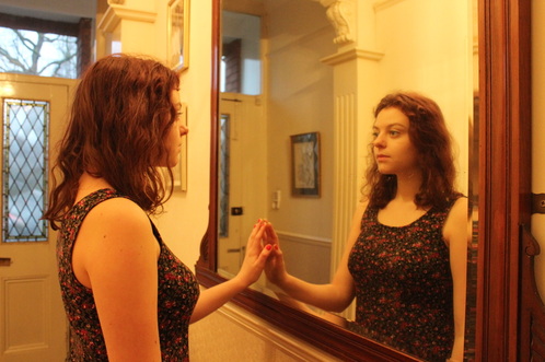
This is the second image that I tried, I attempted to position the character in a different way but I didn't like it, I thought it was to cheesy and fake looking, but I still liked the idea of using the image, therefore I stuck with the first image and did not use this one.
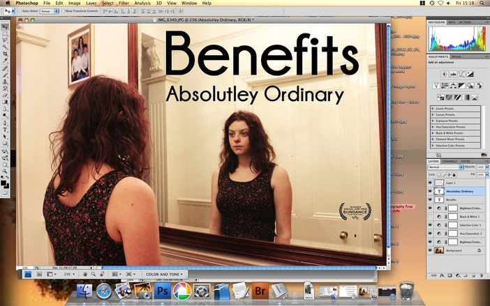
This is the first step of building my poster. I used photo shop to help me do this, my first step was to change the balance in colour, making it brighter and less yellow. I then changed the text title font, to see what I liked and didn't like. In the end I decided to stick with a font called 'Champagne and Limousines' this was big, bold and obvious, I felt it really stood out against the image itself and was a clear way to present my film. I then started to add layers onto my image seen here below.
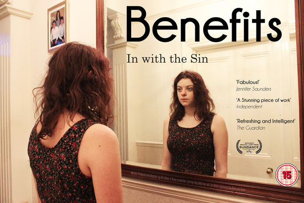
Following my checklist of things to complete whilst creating a poster, I began to add layers to my poster, giving it a certificate, critics, title, awards and a log line. I found this process interesting as I first had to many critics on the poster, this cluttered it and made it looked too busy, I then left it at 3 critics that have relevance to my film. I then added the 15 certificate, this was simple as I downloaded it from the internet and posted it onto photoshop. My final step was to add the award logo.I decided to choose the 'Sundance festival' as this is a festival for independent films, if my film were to be released I would fit in to this category. I like my final poster, I tried to match it to the other realism researched films and there own posters by keeping a realistic setting (It appears to be in a normal house), real lighting, authentic costume, keeping the title big and bold and having awards and critics that would match to my film if it were real.
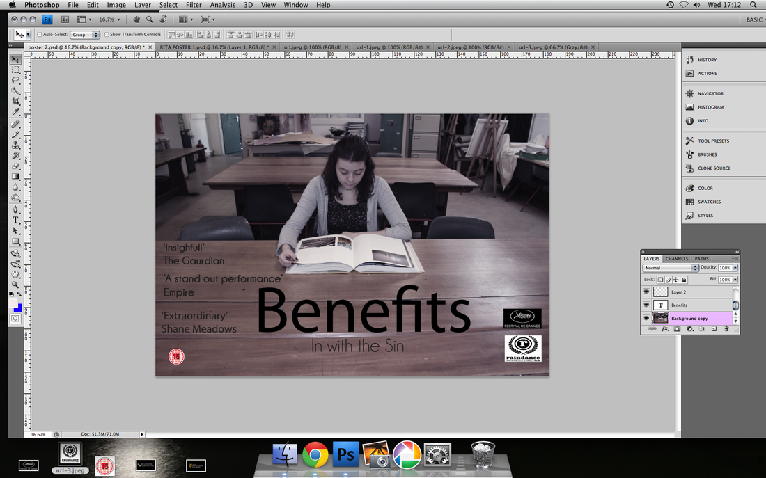
This is the start of my second poster build. I decided to change the location of the poster to target a different audience, this time the girl is at school in a classroom. I like this image as it is still simple but quite ambiguous, the target audience for this poster would be teenagers 16-19 currently at school, as they could possibly relate to my film. I decided to keep the same font as I liked it on my first poster and felt it was a success.
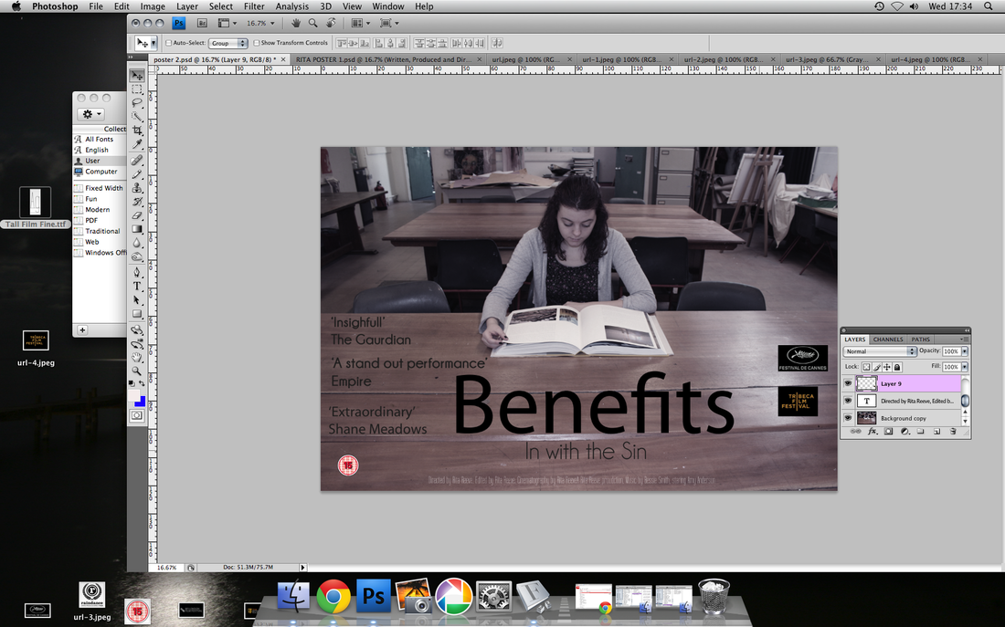
I then started to add text, it was important to me to change the critics as this again targets a different audience and shows the variety of different views people may have on my film. I transferred the certificate from my first poster onto this one as it is the same in both. I also began to add different film festival logo's, from my research I found out the different festivals and awards and which company represented either Independent co's or Hollywood and decided using that information.
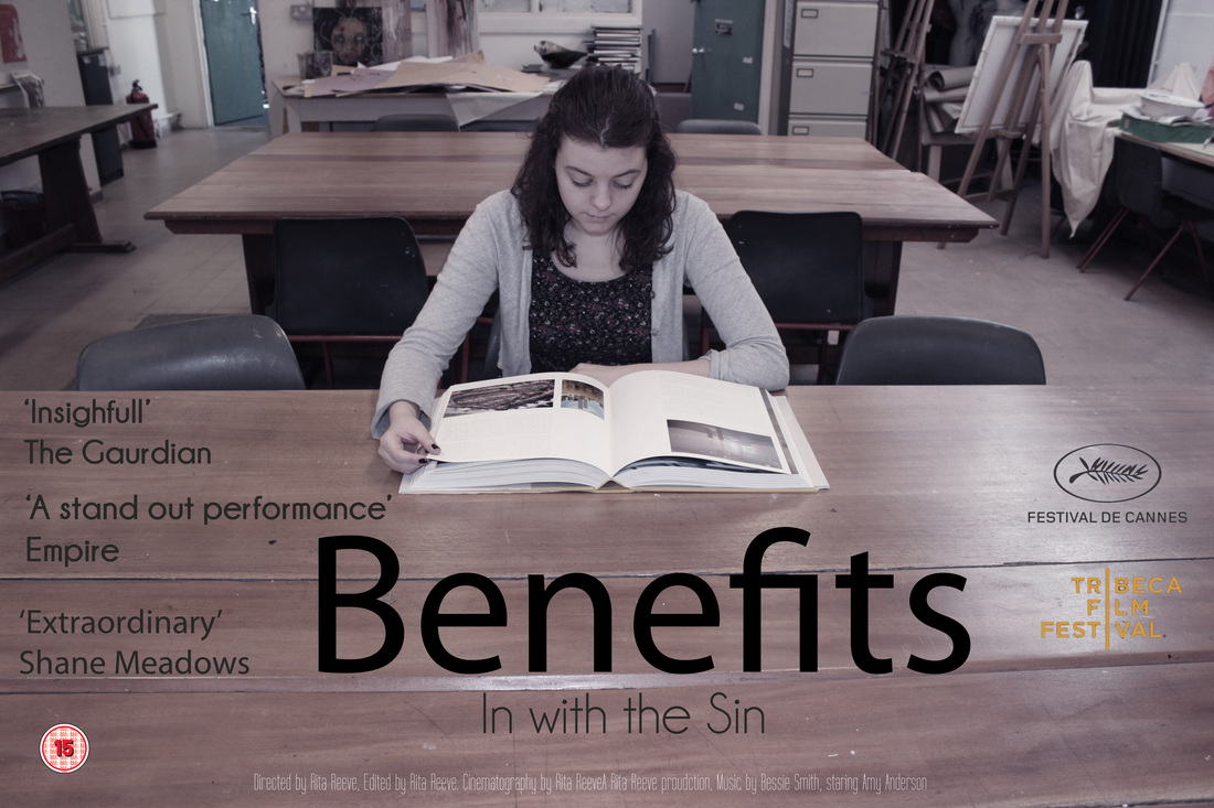
This is the final poster, I liked the photography, and the gritty grey tone it has which represents my film well as it matches the style. I liked the positioning of the character sat trying to work on the desk, as the desk space allowed me to present the text needed within a film poster, It appears clear and simple and not cluttered, this was one of my main aims as this makes a poster more impressive. The big bold font draws people in and gains there attention. Overall I am pleased with my 2 film posters and feel they have improved through trial and error.
